
Logical Empiricism and Knowledge
Visualisation: Isotype as a Universal
Language for Social Statistics
- Başak Aray
_______________________________
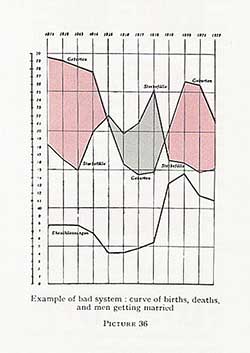
Fig. 1. O. Neurath, International Picture
Language, 1936. Example of a “Bad System” 
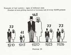
Fig. 2. O. Neurath, International Picture
Language, 1936. Example of a “Bad System”
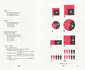
Fig. 3. O. Neurath, International Picture Language, 1936.
Different Methods of Visualizing Quantities
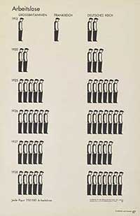
Fig. 4. O. Neurath, Gesellschaft und
Wirtschaft, 1930. Unemployment Chart
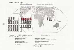
Fig. 6. O. Neurath, International Picture
Language, 1936. The Coffee Trade in 1933
Visualisation through Isotype
The Isotype method was designed by Otto Neurath's team in the Museum of Society and Economy. The museum, founded in 1925 with the help of the socialist municipality of Red Vienna, housed public exhibitions that aimed to instruct citizens about social and economic facts while popularizing quantitative methods in social sciences. Charts displayed in these exhibitions or in the publications ordered by the museum represented social statistics using the Vienna Method of Picture Statistics that later came to be known as Isotype (International System of Typographic Picture Education). Subjects included population statistics regarding age, sex, activity, habitation, demographic evolution, urbanism and accommodation. Some were more argumentative and aimed to show relations between income and health, or between income and longevity. Some charts expressed instructions about health and safety at work. Many of them showed statistical proofs of the improvements of the socialist municipality in housing and healthcare services, while others dealt with more general subjects like the national and global economy, the history of the workers' movement and trade-unionism. In the 1930s the museum collaborated with the Institute of Statistics in the Soviet Union (Isostat), where the Vienna method of picture statistics was officially adopted for public instruction about statistics. Otto and Marie (Reidemeister) Neurath migrated to the Netherlands in 1934, and moved to the United Kingdom later, where they copyrighted the Vienna method of picture statistics and founded the Isotype Institute.
Isotype's method of representing quantities consists in the serialization of pictorial units: a definite quantity is associated with each pictogram, which is then multiplied to fit the amount in question. This method works like a mapping scale, and has the double advantage of maximizing countability and explicitness. To show its superiority to established infographical methods, Neurath gives 2 examples of a bad system. Figure 1 is a highly abstract chart which contains technical elements like coordinates, points and lines. Although useful in a professional context for its exactness, this method is not adapted to mass education because of its excessive technicity, making it beyond the grasp of people outside the professional community of scientists. Figure 2 shows the number of people getting married in Germany from 1910 to 1926. It is meant for a general audience and the use of a pictogram aims to make the subject of the chart visual. But representing varying numbers with size variations in the pictogram limits the expressive power of the chart, since the visual comparison of the size of pictograms has a very restricted instructive value.
Figure 3 compares different methods of visualizing quantities. The first row shows 2 squares. By looking at this chart one can see that 2 is greater than 1 and only guess that B is greater than A, without being able to quantify these differences. The second row shows an improved method of dividing each figure in equal parts, so that now one can precisely say that A is six tenths of 1 and that B is four tenths of 2. Nevertheless, we can only guess that 2 is greater than 1. The third method corrects this by tracing the 2 figures from the same units, so that now one can also numerically compare 1 to 2 and A to B. Isotype opts for this method and uses pictograms as composition units. The additional advantage is the intuitive recognisability of the subject of the chart, pictograms being conceived as stereotypical representations of general concepts.
The unemployment chart (fig. 4) compares the unemployment rates in the United Kingdom, France and the German Empire from 1913 to 1928 by using one single graphic unit, the pictogram of an unemployed worker. Each pictogram represents 250,000 unemployed people, the alignment of which produces a visual effect mimicking a queue in front of the unemployment office. Pictograms are simplified, stereotypical forms suggesting generality at the expense of individual variations. This stylistic choice is in conformity with Neurath's advocacy of quantitative methods in social sciences against individualistic tendencies. It has also a greater communicative effectiveness due to its use of minimalist symbols (mostly drawn as silhouettes, these are easier to identify and remember across a variety of diagrams). Naturalistic elements like perspective, lighting and irrelevant details are avoided in the drawing of pictograms in order to evoke the generality of the represented situation and focus clearly on the main argument. This functionalist aesthetics is opposed to decorative illustration. Each of the graphic elements in Isotype charts has a rational function, including colours. Neurath insists on the linguistic value of the charts as part of the argument and states that they are not mere side illustrations.
To fulfil its intended linguistic function, Isotype imitates the compositionality of verbal language. From a basic set of visual vocabulary which forms the picture alphabet, complex symbols are created by consistent combination (the combination of the signs for worker and coal results in a new pictogram for coal-worker). The compositionality allows a great expressive power while staying within the limits of a small vocabulary, which facilitates understanding the system. Standardization is a key element in the rational quality of Isotype and has a major function in increasing familiarity with the visual language throughout different contexts: that's why the same basic elements and visual syntax will be consistently used in all charts. In the classification of products according to their economic use, a full black figure represents goods produced and consumed locally, a full black figure on a ship, exported goods, and a white figure on a ship, imported ones (fig. 5 ). The addition of a flame means destroyed product, and a sign enclosed in a box, product in stock. The chart for the coffee trade in 1933 (fig. 6) uses various forms of the pictogram for coffee in order to portray the world market for coffee. These conventions are respected for each product, although context can justify some deviations: for example, a flame will mean consumption when combined with a combustible good like coal.


